Finance Graphics: Visualizing Data, Driving Decisions
Finance graphics are visual representations of financial data, designed to communicate complex information clearly and concisely. They are essential tools for analysts, investors, and business leaders to understand trends, identify patterns, and make informed decisions. A well-designed financial graphic can transform raw numbers into actionable insights.
Types of Finance Graphics
Numerous graphic types serve different purposes within the financial world:
- Line Charts: Ideal for showcasing trends over time, such as stock prices, interest rates, or revenue growth. They clearly illustrate increases, decreases, and volatility. Multiple lines can be used to compare different data sets.
- Bar Charts: Effective for comparing discrete categories, such as sales figures for different products, market share of various companies, or budget allocations across departments. Vertical bars (column charts) are commonly used, but horizontal bar charts can be useful for long labels.
- Pie Charts: Best for representing proportions or percentages of a whole, such as asset allocation in a portfolio or the breakdown of revenue sources. They are easy to understand at a glance, but should be used sparingly, especially with many categories.
- Scatter Plots: Useful for visualizing the relationship between two variables, such as risk and return of investments or correlation between economic indicators. They can help identify clusters and outliers.
- Candlestick Charts: Primarily used in stock trading to display the high, low, open, and closing prices of a security for a specific period. The body of the candlestick represents the difference between the open and close prices, while the wicks indicate the high and low.
- Heatmaps: Powerful for displaying large datasets with multiple variables, using color intensity to represent values. They can be used to identify correlations between different assets or sectors.
- Box Plots: Summarize the distribution of data, showing the median, quartiles, and outliers. They are helpful for comparing the distributions of different datasets.
Best Practices for Effective Financial Graphics
Creating effective financial graphics requires careful consideration of design principles:
- Clarity: The graphic should be easy to understand at a glance. Avoid clutter and unnecessary elements.
- Accuracy: Ensure that the data is accurate and presented honestly. Avoid distorting the data to mislead the audience.
- Labeling: Clearly label all axes, data points, and legends. Use concise and informative labels.
- Color: Use color strategically to highlight key information. Avoid using too many colors, which can be distracting. Choose colorblind-friendly palettes.
- Context: Provide sufficient context to help the audience understand the data. Include titles, subtitles, and annotations.
- Audience: Tailor the graphic to the intended audience. Consider their level of knowledge and their needs.
Tools for Creating Finance Graphics
Various software tools can be used to create financial graphics, including:
- Spreadsheet Software: Excel and Google Sheets offer basic charting capabilities.
- Data Visualization Software: Tableau, Power BI, and Qlik offer more advanced features and interactive dashboards.
- Programming Languages: Python with libraries like Matplotlib, Seaborn, and Plotly, and R with ggplot2, provide powerful customization options.
By leveraging the power of visual communication, finance professionals can unlock insights, improve decision-making, and effectively communicate complex information to a wider audience.
 1600×1101 business finance graph illustration stock illustration from www.dreamstime.com
  800×700 finance graphics stock illustration image from www.dreamstime.com
  1600×1483 finance graphics stock illustration illustration analyst from www.dreamstime.com
  5760×3240 finance management illustration orange flat design blue from www.vecteezy.com
  1600×1290 design business financial graphic stock image image capital from www.dreamstime.com
  1600×1290 financial graphic charts stock illustration illustration background from www.dreamstime.com
  5000×5000 set financial analysis tools accounting equipment concept from www.vecteezy.com
  5000×3000 finance design plat en bleu affaires finances illustration dans le from fr.vecteezy.com
  1600×1157 finance graphics stock illustration illustration mathematics from www.dreamstime.com
  1000×1080 finance infographics royalty vector image from www.vectorstock.com
  4500×4500 finance concept flat vector art vecteezy from www.vecteezy.com
  900×780 finance cliparts finance cliparts png images from clipart-library.com
 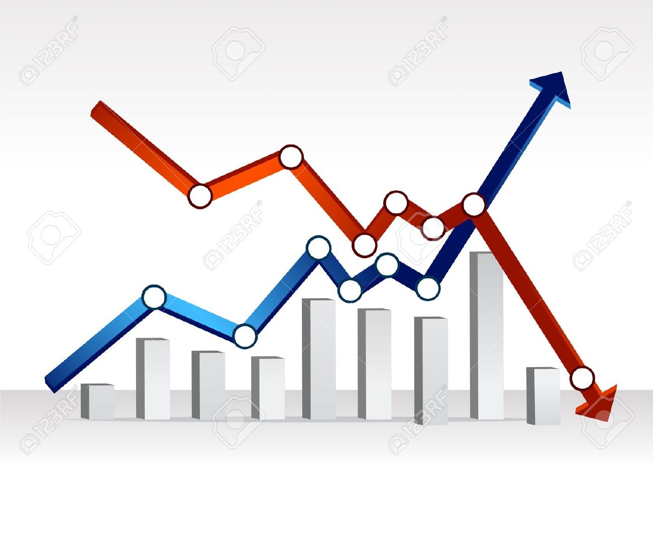 1300×1071 financial graphs graphically speaking from blogs.sas.com
  1600×1479 financial graphic isolated stock illustration illustration from www.dreamstime.com
  1024×768 finance graphics backgrounds finance graphics from www.freeppt.net